Context-aware charting
Type what you discovered and Vizom infers the right chart, labels, and callouts—no manual tweaking required.
Learn moreDescribe your data, pick a goal, and Vizom returns a clean, presentation-ready visualization in seconds.
Vizom handles column mapping, chart selection, and polish so you can ship results without fiddling with design tools.
Type what you discovered and Vizom infers the right chart, labels, and callouts—no manual tweaking required.
Learn moreReady-made themes keep visuals accessible and on-brand across slides, docs, and dashboards.
Explore themesExport slides, responsive embeds, or raw configs so engineering, ops, and exec teams stay in sync.
Start exportingThese exports came from messy CSVs, go-to-market scorecards, and ops reviews. Each one now lives as a quick prompt inside Vizom so teams can reuse the insight instantly.
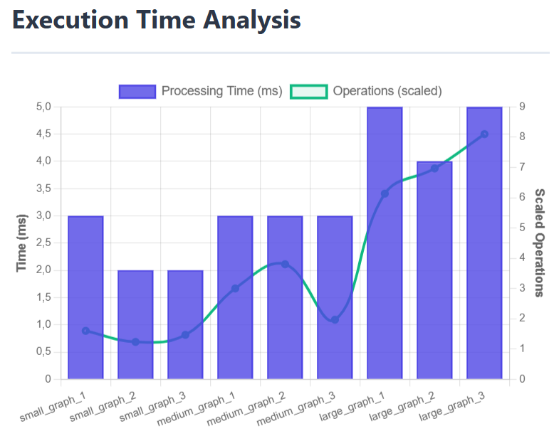
Bar/line combo that helps platform teams explain why latency stayed flat even as job volume spiked.
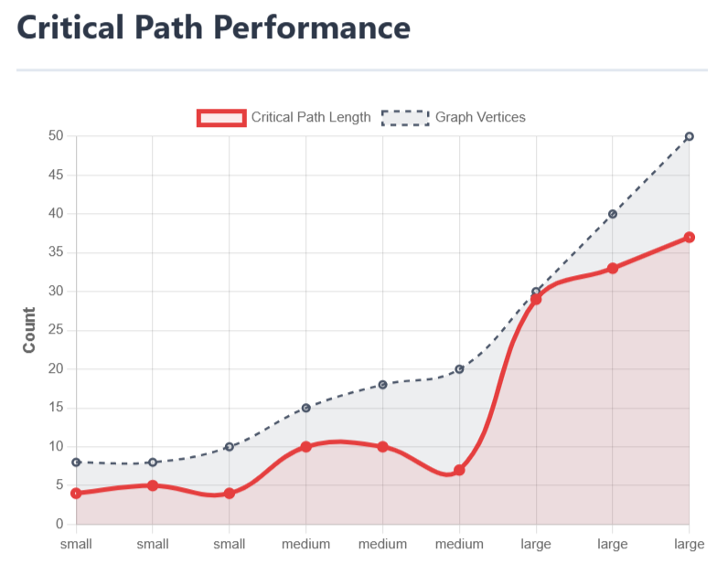
A critical-path story that shows stakeholders where queue spikes happen and how the team keeps work flowing.
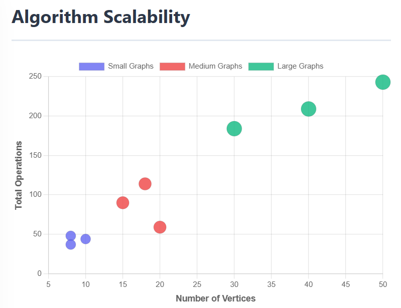
Bubble chart that maps dataset size to total operations so reviewers can see how load spreads across scenarios.
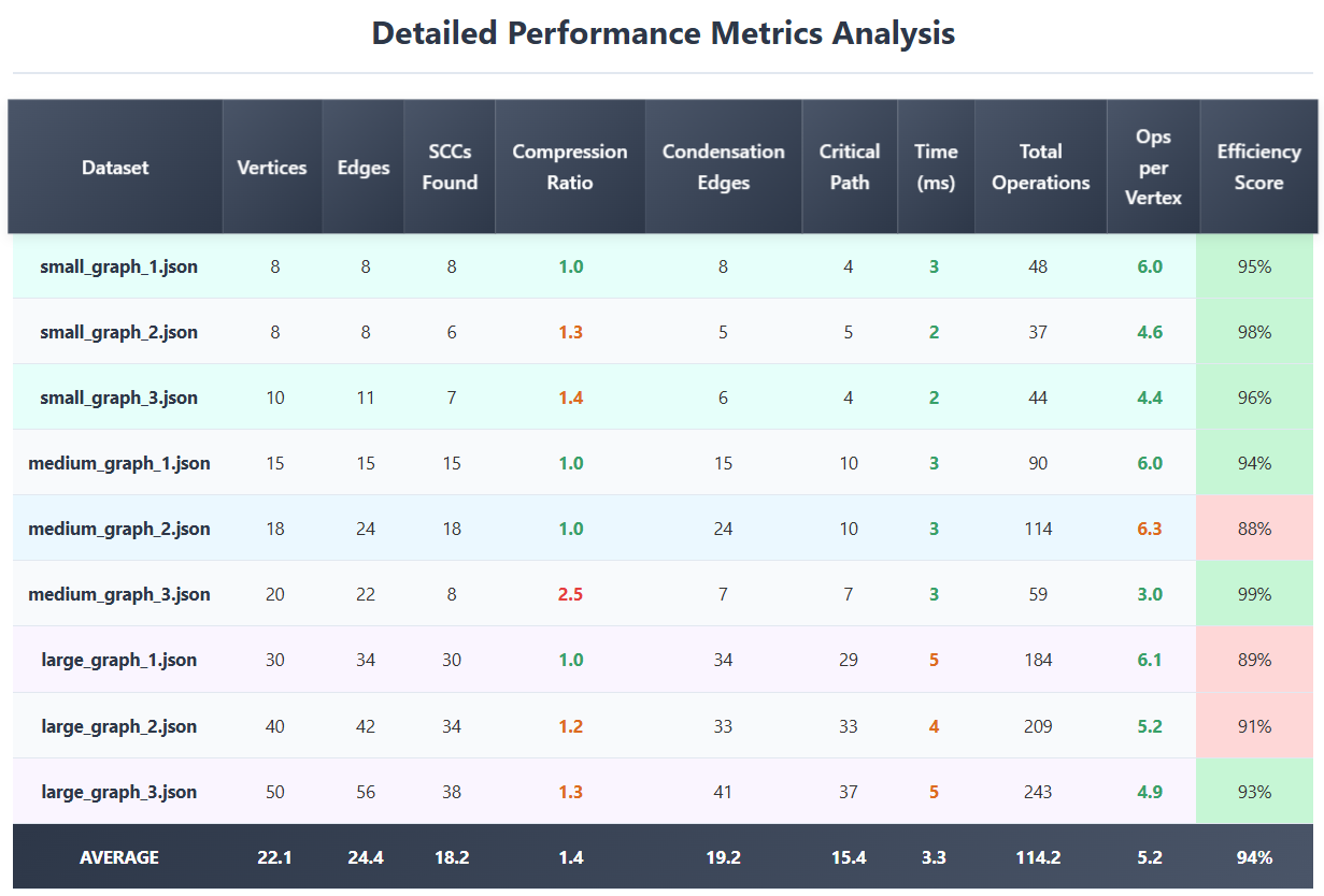
A metrics table that keeps SCC counts, efficiency scores, and throughput summaries in one place for quick reviews.
Curious about the original research? The full algorithm breakdown now lives on the About page.
Each card runs on real sample data—open one to prefill the prompt and preview it directly in the editor.
Marketing · Product · Sales
Velocity trend by GTM team
Marketing · Product · Sales · Success
Ops · Velocity · Coverage · Enablement
Marketing · Product · Sales · RevOps · CS
Stacked team contribution
Cycle time vs. contract value
Marketing · Product · Sales · Partnerships · Expansion
Vizom turns the CSV chaos from student labs and startup standups into investor-ready charts in minutes, no slide deck stress required.